Unit 3: Composition Basics
The way you compose a picture when you take it will determine if you have a snapshot or a photograph. Everyone sees snapshots of vacations and other activities. Your goal is to create memorable photographs that will remain in the mind of the viewer. To do this you must understand some basic rules of composition.
Learning Outcomes
- Decide what type of photograph you will take based on content and purpose.
- Understand the rule of thirds and other rules of composition.
- Describe the basic elements of design and their application in photography.
- Describe the basic principles of design and their application in photography.
3.1: Content and Purpose
Decide what type of photograph you will take based on content and purpose.
Before you take a picture it is very important that you as the photographer ask and answer the question; “What is the main subject of my photograph (or what is going to be contained in my picture)?” Once this question has been answered the second and equally important question that must be asked is, “What is the purpose of my picture?” The answers to these two questions should drive the composition of your photograph.
The usual person finds that when they have taken twenty or thirty pictures and then looked at the results of the day of picture taking they are surprised to find that there are only a few pictures that are really good. The application of the rules of composition and the proper application of the elements and principles of design will increase your satisfaction with your picture taking efforts.
Most picture taking is done to record attendance and participation at events. Usually, the most commonly photographed activity is a vacation. The pictures taken at a vacation or other family gathering help you relive the moment and share your experience with family and friends. Pictures of an event that are more thought-out but fewer in number create more excitement about your experience as opposed to more pictures with no thought behind them. A well-thought-out picture stimulates better conversation and interest in your work as a photographer.
This does not mean that you shouldn’t experiment with different composition ideas. With a digital camera, you have the option of trying several different compositions. You can also review and delete the pictures of lesser quality. This editing process can be completed while you are still on location. If you are dissatisfied with your results, you can try other compositions to achieve a picture that will be memorable to you and of interest to those who will view it.
Remember to answer the two questions, “What is the main subject of my photograph?” and “What is the purpose of my picture?” before you determine the composition of your picture. If you will thoughtfully consider these two questions at the beginning of the picture taking process your work will be much more satisfying to you and pleasing to others.
3.2: Rule of Thirds and Other Composition Rules
Understand the Rule of Thirds and other rules of composition.

Rule of Thirds
Now that you have determined what your subject will be and what the purpose of your photograph is, it is now time to consider how to compose your picture. Perhaps the most important rule to keep in mind when composing a picture is the rule of thirds. To help you better understand this rule view this PowerPoint.
The rule of thirds helps you as the photographer compose a picture that will be aesthetically pleasing to the viewer. Most digital cameras have a rule of thirds grid that can be viewed through the view screen. This grid helps the photographer see the rule of thirds application while composing the picture.
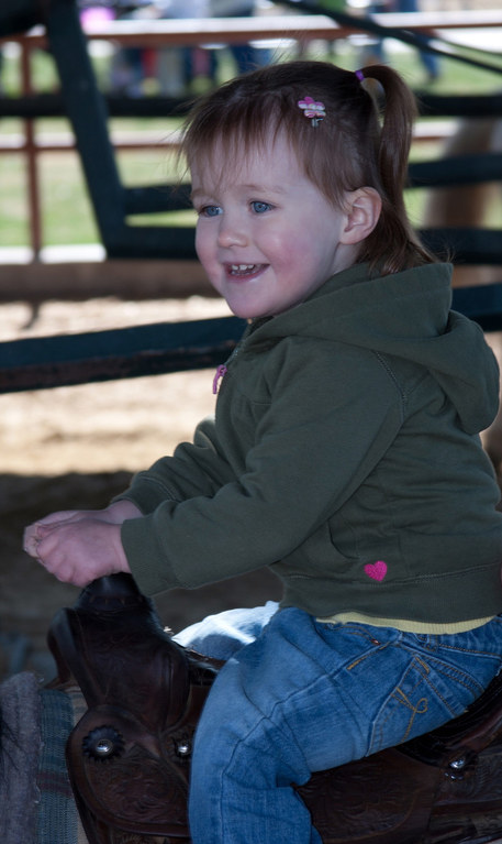
When your main subject is a person or animal, the picture must be composed with the subject looking into the picture. In the picture shown the girl is placed on the left third line looking to the right into the main body of the picture. This directs the viewer to look into the picture.
The rule of thirds helps you as the photographer compose a picture that will be aesthetically pleasing to the viewer. Most digital cameras have a rule of thirds grid that can be viewed through the view screen. This grid helps the photographer see the rule of thirds application while composing the picture.
When your main subject is a person or animal, the picture must be composed with the subject looking into the picture. In the picture shown the girl is placed on the left third line looking to the right into the main body of the picture. This directs the viewer to look into the picture.
Changing Your ViewpointWhen you are willing to move to a new location to take your picture, you can change the appearance of your picture. Move to the right or to the left. Equally important is the thought of getting down low or moving to a higher vantage point where you will be looking down on your subject. The picture on the left also illustrates the next important rule: Fill the frame.
|
|
Fill the Frame
|
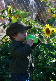
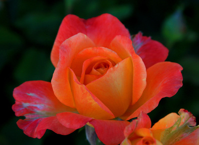
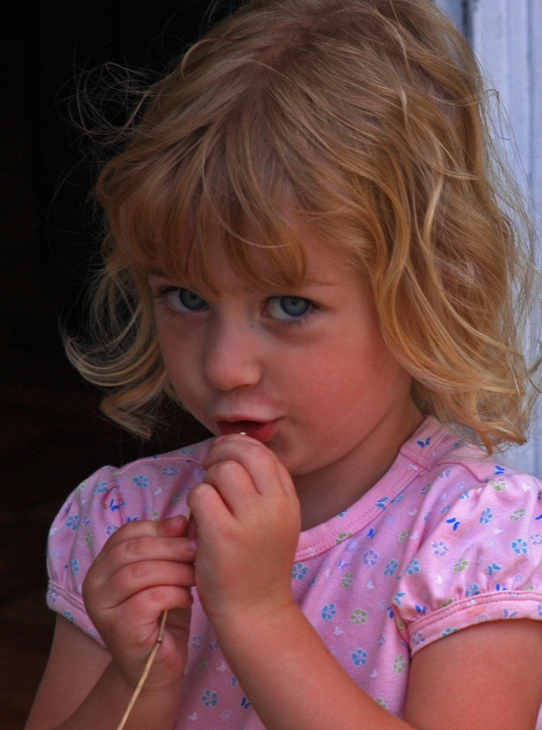
Filling the frame is one of the easiest rules to follow, but it is one of the most often-violated rules. When the picture on the right is viewed the viewer must wonder if it is a picture of some sunflowers and a small boy got in the way. The viewer may also wonder if the subject of the picture is the little boy. Because of the lack of contrast between the boy’s clothing and the background he is lost in the background.
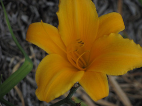
The picture of the flower leaves no question about what the subject of the picture is. When the viewer has to ask what the subject of the picture is, then you have confused the picture with non-important parts. The picture of the baby has no distractions in the background. By getting in close the photographer has filled the frame with the subject and left no question what the subject of the picture is. |
|

|
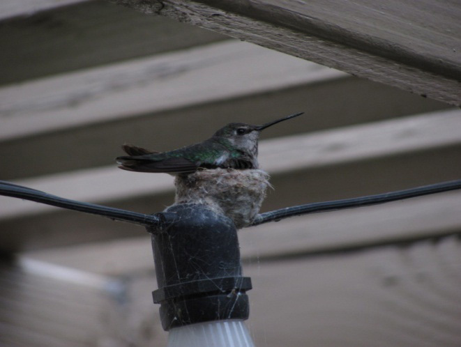
When you look at the two pictures of the hummingbird, the one with less background clutter helps you to focus more on the bird and less on the background.

Frame filled with the hummingbird.
|
Frame cluttered up with more background image.
|
Horizon Line
|
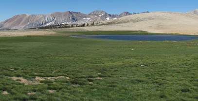
The placement of the horizon line is important because it creates interest and impact in your photograph. When you select the placement of the horizon line, it should almost never be placed in the middle of the picture. For best results, the rule of thirds should be used. Placing the horizon line on either the upper or lower third line will give greater impact to your picture.
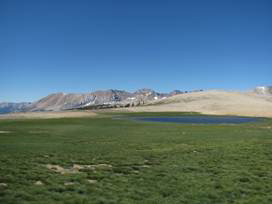
A low horizon line would be used when there is more interesting subject matter above the horizon line. An example of low horizon line placement would be when you have an interesting sky. The picture of the rainbow has a low horizon line because the dark sky and rainbow have much more interest than the green grass in the foreground. In the landscape picture of the mountains the picture is cut in half by the horizon line. The viewer is asked to decide between the green meadow and the blue sky for the area of greatest importance. When the horizon line is moved to the upper third of the picture, the focus in the picture is placed on the vast distance to the mountains. In conclusion, it is helpful to remember the words of the photographer Ansel Adams when talking about the need for thoughtful photographic composition. He said, I have often thought that if photography were difficult in the true sense of the term-- meaning that the creation of a simple photograph would entail as much time and effort as the production of a good watercolor or etching-- there would be a vast improvement in total output. The sheer ease with which we can produce a superficial image often leads to creative disaster. We must remember that a photograph can hold just as much as we put into it, and no one has ever approached the full possibilities of the medium.
During your current study of photography, it is important that you consider composition very carefully as you prepare to create pictures. Your use of these rules will aide you as you apply them to the elements and principles of design.
|
Horizon line in center of frame
Horizon line in upper third of frame.
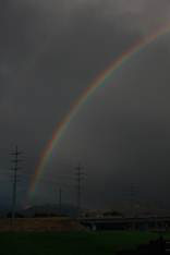
Low horizon line emphasizes rainbow in the sky.
|
3.3 Elements of Design
Describe the basic elements of design and their application in photography.
The seven elements of design are color, form, shape, line, space, texture, and value.
ColorColor psychology pertains to how color can affect a viewer. As a photographer, you can create a mood or feeling in your photograph and color can be a large part of the effect. Certain colors can inspire anger (vibrant red), depression (somber blue), passion (deep red), insanity (acidic yellow-green), purity (very pale colors), spring (grass green and pastels), or happiness (sunshine yellow). Careful thought should be taken by the photographer about the color palette used to give the desired effect of the photograph.
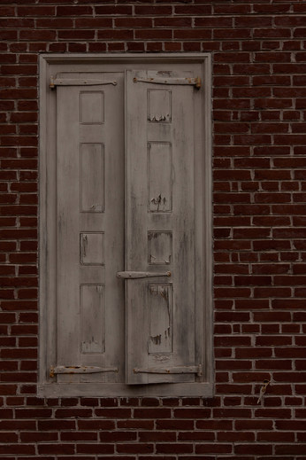
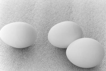
ShapeA shape is a perceived area of like value or color and a form is the same except that it generally appears to be a three-dimensional shape through modeling of value. In composing your photographs, shape will probably play the most important role. Most often, lines are really just narrow shapes and the other elements are shapes filled with textures, values, or colors. The shapes that you will see through your viewfinder can be mechanical, man-made, geometric shapes, or more natural, fluid, organic shapes.
SpaceHow the photographer divides space will create interest in the picture.
Division of Space: Positive/Negative Space (Figure/Ground Relationship)Many novice artists only deal with the positive space or figure in an image. This translates as the subject. For instance, if you took a close-up photo of a doughnut on a plate, the subject, and therefore the positive space or figure, would be the doughnut. The negative space or ground would be the hole in the doughnut and any portion of the plate visible on the edges of the photo. Often, the negative space can be considered the visible background in an image.
Professional artists know that backgrounds play a very important part in their images. You should at least think about how the subject is going to "break up" the space in your images and by doing so decide which parts to let show of the ground or negative space. 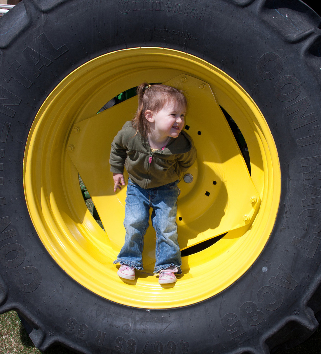
Space
Depth of Space |
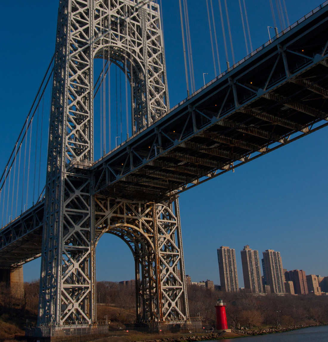
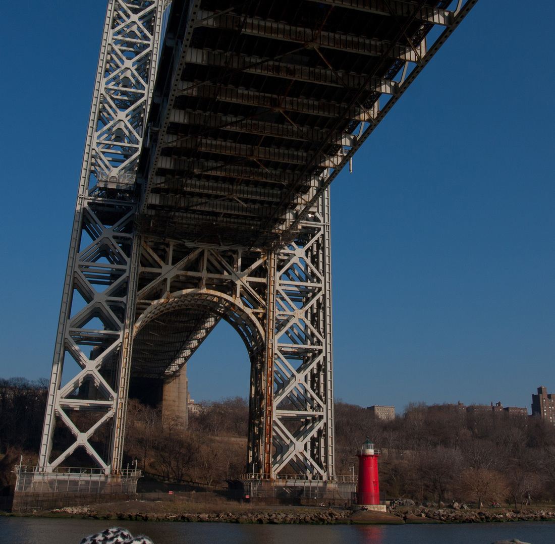
FormForm is best described as the use of objects in a picture that have three dimensions. Examples of objects with three dimensions would include the geometric shapes. These shapes might include the cube, sphere, or cone. One of the easiest examples of form would be the use of buildings in a picture.
LineA line can be described as a shape that is much longer than it is wide. A rectangle could be a line, and so might an oval, if it appears long enough relative to its width. A thin shape becomes a line. Lines can be an effective element in composition.
They can direct your eye to different parts in an image, which is known as directional line or leading lines. A line can also "feel" a certain way. A horizontal line can emote peacefulness, calmness, and stability, while a vertical line may emote rigidity, power, and height. The diagonal line is usually known for its dynamics, energy, or movement and the curvilinear line usually describes fluidity, grace, and the organic. While these descriptions are not all inclusive, they are the norm and should be at least considered when composing an image utilizing line. 
Positive/negative space
|
There are several ways to create the illusion of depth on a two-dimensional surface. The illusion of space or depth in your photographs can invite the viewer into the image.
Depth of space
Angle of View and Lens Focal LengthsThe perspective can seem to change by changing the focal length of your lens as discussed in lesson 1 under “Lenses.” Briefly, wide-angle lenses create a greater sense of depth; telephoto lenses create a more shallow sense of depth. (Note that a view camera can change perspective through "shift and tilt" because the view camera's lens board and back can be moved independently of each other.)
Placement of objects
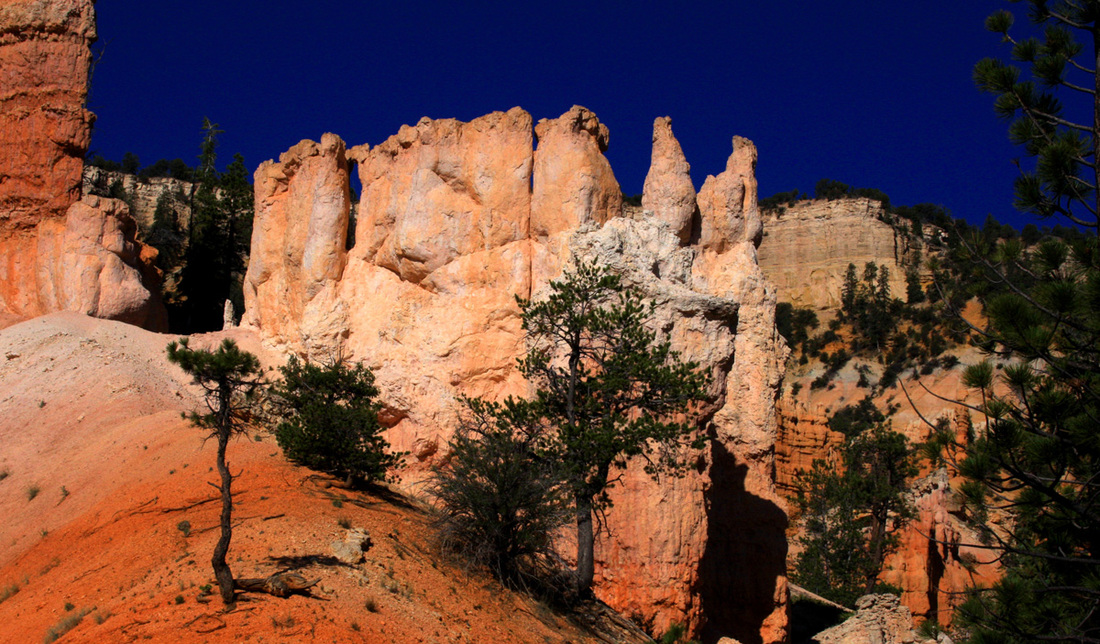
TextureActual texture is the way an object actually feels (that is to say, soft, smooth, hard, prickly, slimy, rough). In photography, the photograph's actual texture will remain constant, like that of paper, while the implied texture will change with the image. The implied texture in a photograph is determined by the value, or lights and darks, of certain shapes. A soft-appearing shape is made by a softly shaded edge and a hard appearing shape is created when there is an abrupt contrast in value or hard edge to the shape.
ValueValue is the artistic term for lights and darks. Of course, in black-and-white photography, value is seen as white, black, and the grays that fall between these value extremes.
Value can play a crucial part in the story-telling process of photography. Value can create exquisite flat shapes, extraordinary three-dimensional-looking forms, slick or rough implied textures, and—perhaps most importantly—a "mood" to your photograph. 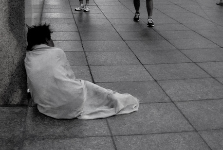
Value
|

Lens focal lengths
Placement of Objects (Foreground, Middle-Ground, and Background)Of course, having a foreground, middle-ground, and a background will create a greater sense of depth than having a single subject with no background at all. Usually, objects placed higher on the image seem to be further away from the viewer. Closer objects tend to be at the bottom of the image. Sometimes it can be interesting to reverse this norm.
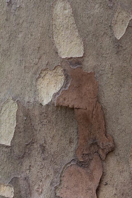
Texture
|
The following is a description of various value schemes and their application.
|
Full tonal range is the standard when assessing a photograph. For most of your photographs, you will want to include a full range of values, from white to black with many gray transitions in between. You will want detail in the highlight areas and detail in the deep shadow areas the majority of the time; however, because photography is an art, it may be necessary to break these rules to achieve a "correct" feeling.
Low key images are composed of mostly dark values. Low key images tend to feel moody, mysterious, and sometimes heavy. 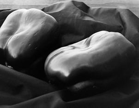
A low key image
A high key image
|

Full tonal range
A high key image is an image that is composed of mostly light values, like an image of a white rabbit on the snow with very soft shadows. This type of image generally creates the feeling of lightness and purity. It is sometimes used for portraiture, especially for infants, toddlers, and brides.
|
3:4 Principles of Design
Describe the basic principles of design and their application in photography.
The nine principles of design are balance, emphasis, harmony, movement, proportion, rhythm, unity, variety, and pattern.
Balance
Balance is created by visual weights in an image. The left side of the image should usually "feel" balanced out by the right, and the top should feel about equal to the bottom, with the top sometimes feeling a bit lighter. This is the general rule and, once again, may of course need to be broken once it is understood.
Formal/Symmetrical BalanceThis is the easiest type of balance to understand. The image is balanced out either vertically or horizontally by creating a mirror image (or close to it) of the other side (see figure to the right). One example would be an image of two people sitting side by side, centered in the middle of a photograph. Formal balance is said to create a sense of order and ease to the eye.
Symmetrical balance
Informal balance
|
Horizontal symmetrical balance
Informal/Asymmetrical BalanceThis type of balance is usually more interesting and may be more intuited (or sensed) to achieve.
One side balances the other by creating an equal visual weight to the other side without using a copy or mirror image (see figure to the left). For example, there may be a person's face on one half of the image and to balance it out there may be a curtain, a window, a texture, several smaller elements, etc. The goal is to balance the one side with another element (shape, texture, color, value, lines) that is different from the first side and yet has a similar "visual" weight. |
Emphasis
Emphasis by Contrast
What can grab the attention of the viewer's eye? Well, the eye is usually drawn to subjects that are different from their surroundings. This is called emphasis by contrast. For example, if your image is of many overlapping circles, and there is just one square shape, your eye would naturally single out the square because it is unique. The circular shapes are contrasted by the square shape. If your image is mostly dark in value and one object is very light, guess what your eye will see first. That's right, the light value because it is the one thing that is different (contrast). Your image can be very boring without creating some focal point for the viewer to notice. Other elements to contrast to create an emphasis could be shapes (organic vs. geometric), color (bright vs. dull), textures (rough vs. smooth), value (lights vs. darks), focus (blurry vs. sharp), and so forth.
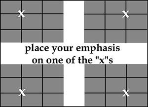
Emphasis on the "Rule-of-Thirds"
|
As soon as you understand how to create an emphasis, where should you place it in your photograph? You can place it anywhere you want! However, you need to be aware that you will create very different feelings for the viewer depending on your decision. The rule-of-thirds is a guideline for "good" composition, which basically states that your composition will improve if your emphasis is placed close to one of the thirds of your photograph (see figure).
Remember, this is a guideline only, one that in my opinion does seem to help the images of many beginning photographers. However, there will be instances where you will want to place the subject in the very middle of your image to create a static, solid, and lonely feeling. There may be times when the subject must be placed directly on the edge of the photograph to create some specific tension. |
Rule of thirds emphasis
|
Emphasis and rule of thirds
HarmonyThe blending of more than one element to create a photograph that is more calm and restful in appearance is harmony. Harmony is achieved when there are no distractions in the picture. The photographer has brought harmony to their work when there is a feeling of peace and belonging when the photograph is viewed.
MovementVarious techniques can be used to create a sense of motion in a photograph. Repeated or multiple images, fuzzy outlines of the object in motion, directional lines, and diagonal lines can all be used to create a sense of motion.
Movement
ProportionIf you have ever seen a beautiful, large moon on the horizon, you have probably desired to photograph it. It will generally not look so great when away from the horizon.
This is because when the moon is on the horizon it is near mountains, houses, trees, etc., which give us a reference to its size. Without these references, the moon is just a small, round, whitish circle on black. Larger objects tend to appear close and small objects tend to be further away. However, a recognizable subject needs references to tell our brains its relative size. 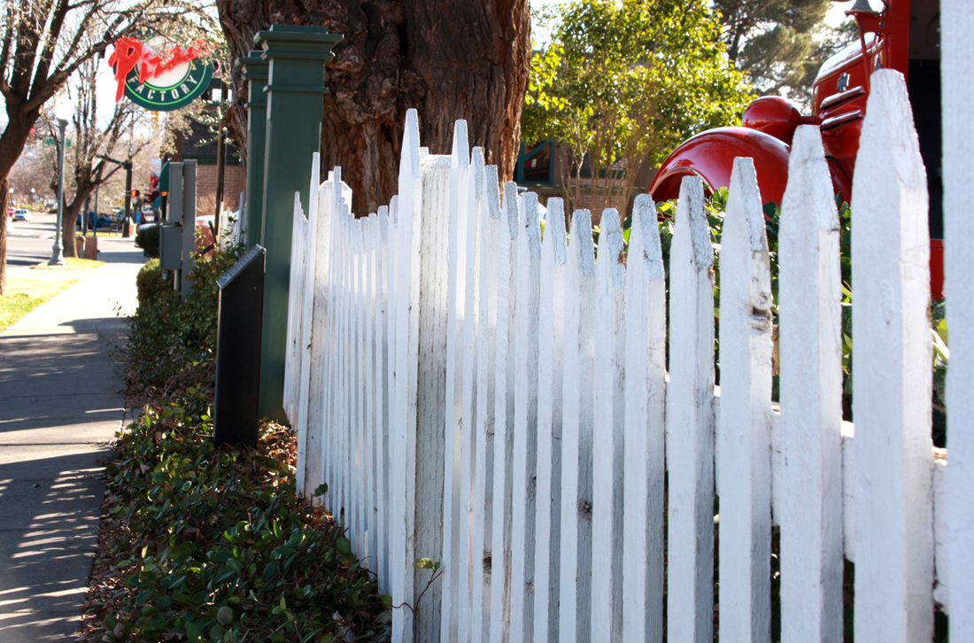
Rhythm
UnityUnity in an artwork means that the whole piece is noticed before specific parts of the piece. When all the parts of a photograph are in visual agreement to the whole, it creates a sense of unity and harmony. Any of the elements (lines, shapes, colors, textures, and values) can be clustered, repeated, grouped, or aligned to create a sense of unity. If you cannot find relationships between the parts of your photograph, it will lack unity.
VarietyVariety is said to be the spice of life. However, too much variety can create a chaotic image.
Usually, you will want to unify your photographs while adding some variety to generate some interest.For example, you may wish to repeat a shape, like a circle, in your photo. But, to make it interesting, these circles may vary by use of another element of design, such as, size, color, texture, or value. 
Variety
|
Harmony
Proportion
RhythmThis principle is often referred to by its sense of movement. Rhythm directs the viewer's eye across similar, repeated elements. A photograph of books on a shelf, sand dunes, ocean waves, or tree trunks in a forest could all easily produce a sense of rhythm.
Unity
|
Pattern
Related to texture, pattern is made by repetition of a design or element with a higher degree of regularity. If the repetition arouses our sense of touch then we consider it to be texture and if it arouses our sense of design, it is a pattern.
